Ambilight effect for the Web with CSS
April 13, 2023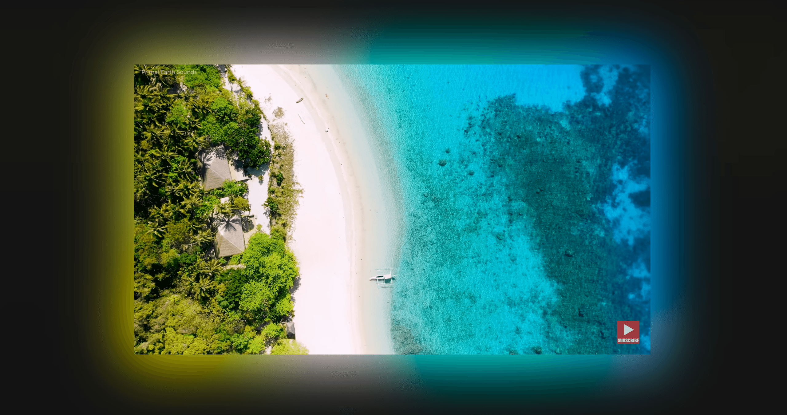
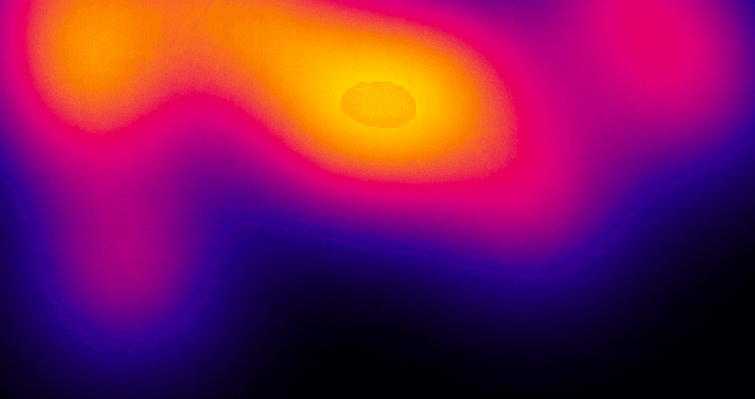
Have you ever heard of the "Ambilight Effect"? It's a feature in some TVs that illuminates the wall behind the screen with colors that match the content being displayed. This effect enhances the viewing experience by "extending" the image beyond the TV onto a wall behind it creating more immersive experience.
Some time ago I stumbled upon this article by Joe Bell where he tried to recreate the effect with CSS.
The problem he encountered was that implementing the effect using more conventional CSS features involved using many elements and while the result looked great for bright images, it didn't look nice for dark images.
What if there's another way to do it?
I challanged myself to recreate the effect using SVG filters and eliminating both of the problems mentioned above.
Not only that, but since it's a filter, we could apply it to any element! (well, with some exceptions)
The filter doesn't work on videos and animated elements in Safari and Firefox.
Applying any complex filters might cause performance issues, so try to use them sparingly and test them on different browsers and devices.
Results may slightly vary browser to browser so proceed with caution if you plan on using this in production.
How to use
As with any custom SVG filter, just paste the SVG in your HTML and then apply it with CSS:
<svg width="0" height="0"> <filter id="ambilight" width="300%" height="300%" x="-0.75" y="-0.75" color-interpolation-filters="sRGB" > <feOffset in="SourceGraphic" result="source-copy" /> <feColorMatrix in="source-copy" type="saturate" values="3" result="saturated-copy" /> <feColorMatrix in="saturated-copy" type="matrix" values="1 0 0 0 0 0 1 0 0 0 0 0 1 0 0 33 33 33 101 -132" result="bright-colors" /> <feMorphology in="bright-colors" operator="dilate" radius="10" result="spread" /> <feGaussianBlur in="spread" stdDeviation="30" result="ambilight-light" /> <feOffset in="SourceGraphic" result="source" /> <feComposite in="source" in2="ambilight-light" operator="over" /> </filter> </svg>
.ambilight { filter: url(#ambilight); }
How it works
If you're new to SVG filters I highly recommend reading this awesome SVG Filters 101 article first.
So here's how the magical filter works. It may look daunting but if you read it carefully and play with the Ambilight Effect Generator in the next section you should get an idea of what it actually does.
- Increase the filter Filter Region to 300% by using the width and height attributes, then centering the region with the x and y attributes. This makes sure that the "Ambilight" light source is not clipped by the object bounding box.
- First feOffset makes a copy of the SourceGraphic. It will be used as a base for our "Ambilight" light.
- Then, feColorMatrix takes that copy and saturates it by 3x.
- Then another feColorMatrix removes dark pixels from the previous step. The -132 is our color cutoff parameter that removes pixels that are below 32% brightness.
- feMorphology spreads the bright colors from the previous step outwards. This is our "spread" parameter that controls how far the "Ambilight" light source will spread.
- Then using feGaussianBlur we blur the previous step. This is our "blur" parameter that produces the final "Ambilight" light source effect.
- Finally, using feOffset we copy the original image again and use feComposite to combine it with the ambilight light source from the previous step.
Ambilight Effect Generator
To see what happens under the hood, reset all sliders and check the "Hide source" checkbox.
Then go fiddle with them one by one to see what happens!
The default state is what I figured was the best configuration for the filter, but you can tweak it to your needs and generate a filter that suits you best.