Using HTML elements as CSS masks
April 19, 2023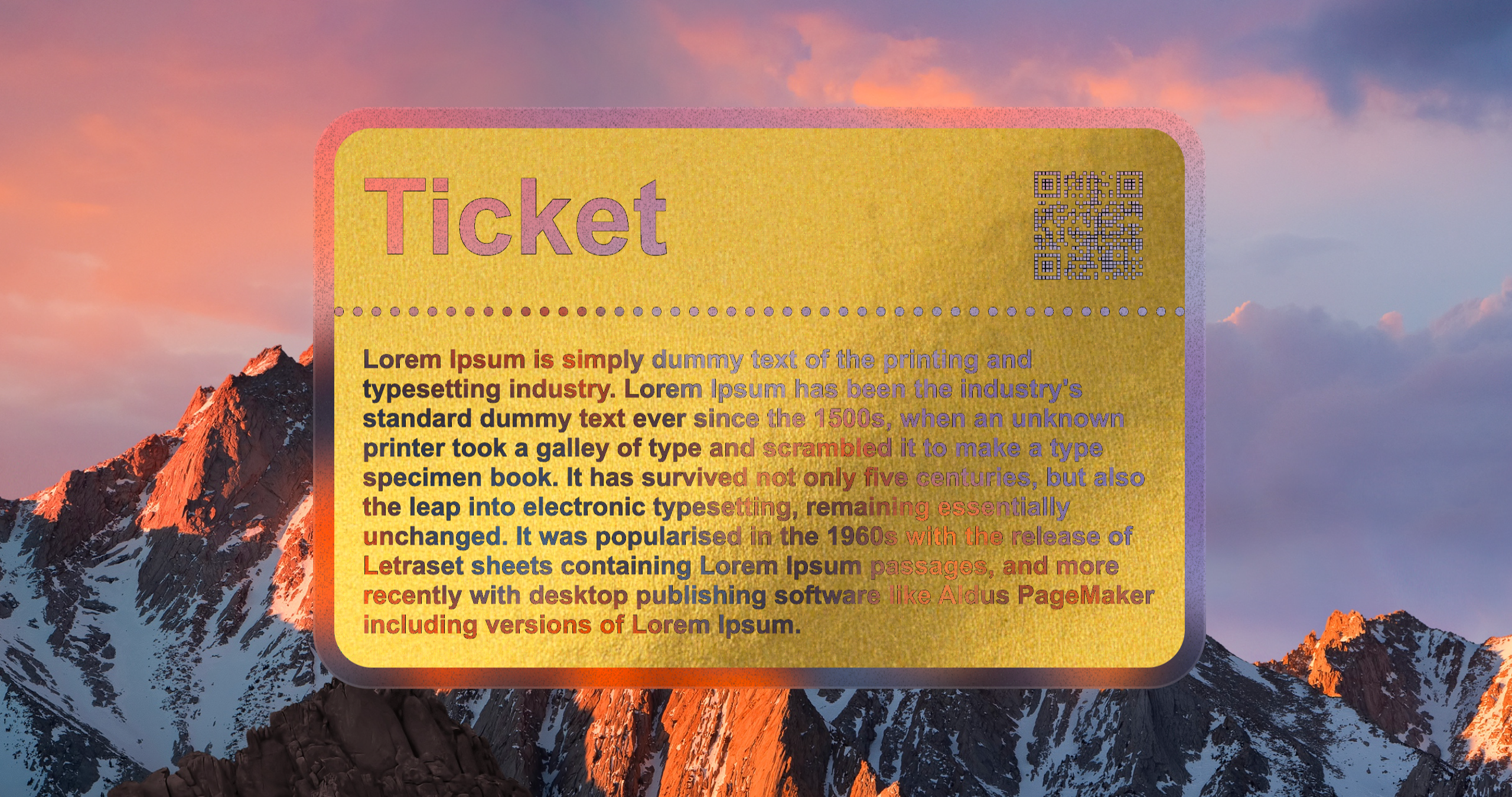
At some point you might have tried doing a "cut out" or "knockout" effect with CSS. Its an effect where part of an element is see through, appearing as if that part was cut out.
There are a few techniques we could use to achieve similar effect:
-
clip-path: allows you to specify a polygonal or circular shape (or any other shape defined in SVG clipPath primitive) to clip an element. The clipped portion of the element will be invisible, revealing the content behind it.
-
mask-image: lets you use images, CSS gradients or SVG graphic (or combinations of them) to mask or hide portions of an element. Similar to clip-path, the masked area will be invisible and reveal content underneath it.
-
SVG graphic with mask: you can define entire graphic with SVG and use the mask primitive to mask certain parts of it.
-
background-clip: text: The background of an element is clipped to the foreground text.
-
mix-blend-mode: lets you blend HTML element with elements behind it.
There are, however, some limitations to these techniques. For example, you can't use them to cut out text. You could, of course, use a mask image with text in it, but it causes some major problems. Imagine you have a website that supports 10 different languages - you'd have to use 10 different mask images to support each language. Not only that, but to make things accessible, you'd still have to add the text to the DOM, then hide it visually. Even if you did that, you would still miss out on responsiveness. Since the text is baked inside an image, you're not getting things like text wrapping, word-break, text-overflow ellipsis, and other features that we're so used to on the Web.
The background-clip approach only paints the text with the background of the element, it doesn't really show what's behind it.
The only technique that kinda works with text is the mix-blend-mode but it only really works if you want to use a black and white element, which is rarely the case. Any other color combination will make entire element appear to be semi transparent. On top of that, you won't get the desired effect when applying drop-shadow() filter to it, as the element is not really cropped but blended with the background.
Most of these techniques are also awkward to work with, right? I mean you have to use bunch of images, or work with SVG paths to define the shape you want to make invisible.
Is there a better way to do it?
The perfect technique
The perfect technique would allow us to explicitly specify which elements we want to crop out of the target element. Effectively using DOM HTML elements as a CSS mask. Something like:
"In #my-element, cut out its dashed border, heading and paragraph".
But then how do we actually tell the browser which parts need to be cropped out? And how do we crop them? Well, there's another way we can formulate our ask above, that will also tell you what's the implementation. And it goes like this:
"In #my-element, make all of the black pixels transparent".
That would allow us to use any HTML element with a combination of any CSS property, to achieve the effect we want. Since we're operating on color, we could crop out dashed border, text shadow, background-image... you can crop literally any shape you want, as long as its color is black.
I've called this technique ...
Black Pixel Masking
Since we want to modify specific pixels of a target element, we need to use a custom CSS SVG filter.
Here's how it works:
- with feColorMatrix we take the SourceGraphic and turning all non-black pixels fully transparent.
- then using feMorphology we're making these black pixels a tiny bit thicker, to make the edges of the cutout smoother.
- finally, with feComposite we're taking the SourceGraphic and clipping it with the result from the previous step.
<svg width="0" height="0"> <filter id="remove-black" color-interpolation-filters="sRGB"> <feColorMatrix type="matrix" values="1 0 0 0 0 0 1 0 0 0 0 0 1 0 0 -255 -255 -255 0 1" result="black-pixels" /> <feMorphology in="black-pixels" operator="dilate" radius="0.5" result="smoothed" /> <feComposite in="SourceGraphic" in2="smoothed" operator="out" /> </filter> </svg>
Once you embed the SVG filter in your HTML, you can use it in CSS like so:
#my-element { filter: url(#remove-black); }
The result you're going to see is that all black pixels are just removed, leaving the rest of the element intact. See examples below and toggle the checkbox to see how these examples look without the filter on.
Whoa!
This is awesome.
Now, what if we want to have black elements inside our target element that we don't want to be cropped out?
Then, we can use the white color instead of the black color to target the pixels that we want to clip.
Then using CSS filter chaining, we invert all colors (so that white pixels turn black), remove the black pixels using our filter, and finally inverting the colors again to get the final result.
#my-element { filter: invert(1) url(#remove-black) invert(1); }
Limitations
This technique seems to work reliably on all major browsers, but it has some limitations:
-
you can only use black or white color to clip elements,
-
the filter will not clip the backdrop blur, It will remove the color from marked areas, but the backdrop blur will stay (as opposed to CSS mask or clip-path which will remove the blur in the clipped area).
-
the masked area is slightly thicker than black pixels on the target element due to smoothing.
If you want more accurate clipping (with slightly jagged, dark edges), set radius="0" on the feMorphology element.