Blur Vignette effect in CSS
June 12, 2023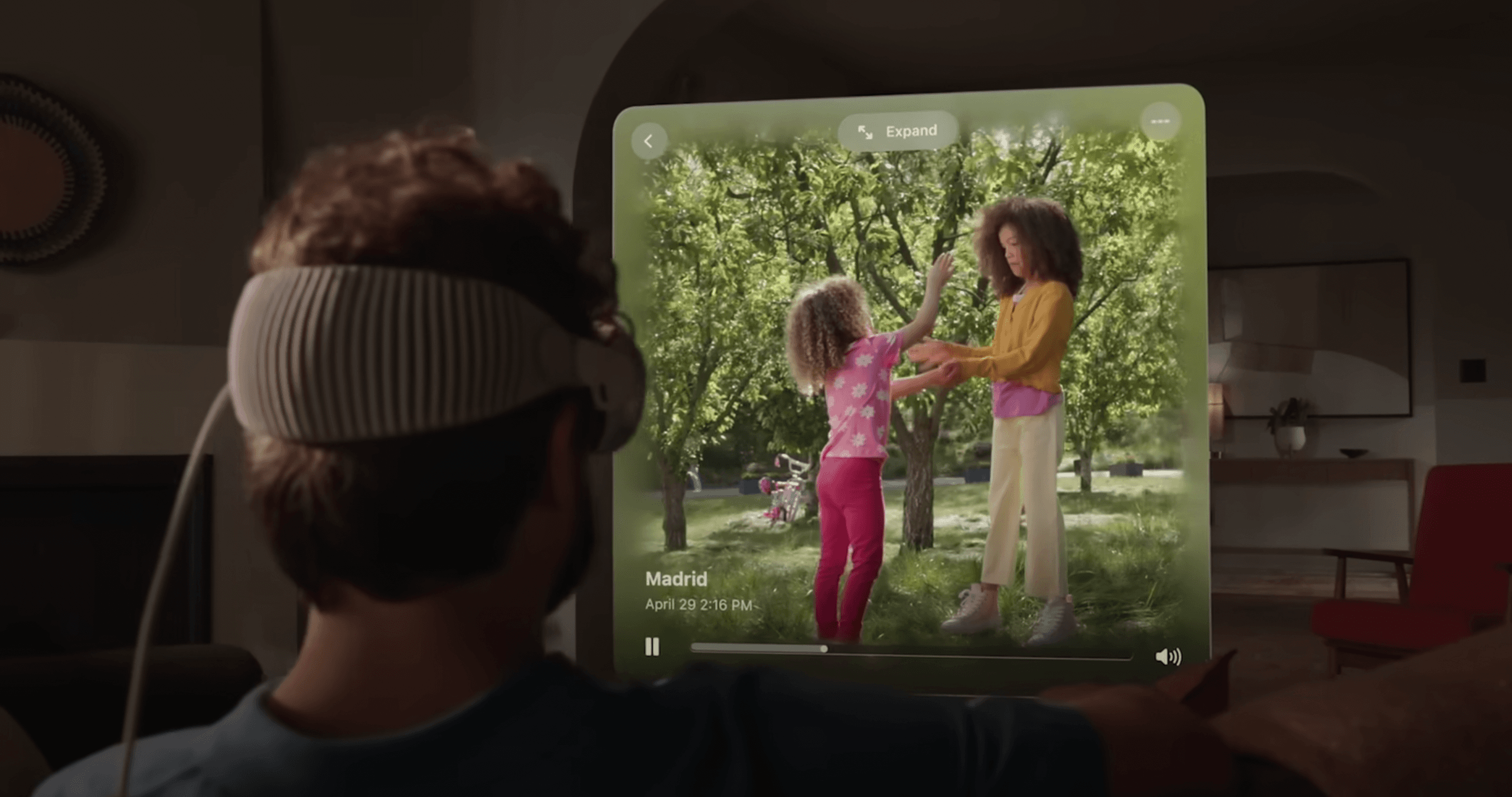
During the last WWDC23 Apple event where Apple Vision Pro was revealed, I've noticed this cool Blur Vignette effect that was applied to the 3D content when it's watched in a headset.
And so I've decided to recreate it with pure CSS!
Below you'll find a brief explanation of how it works and a CSS generator that will let you customize the effect to your needs.
How it works
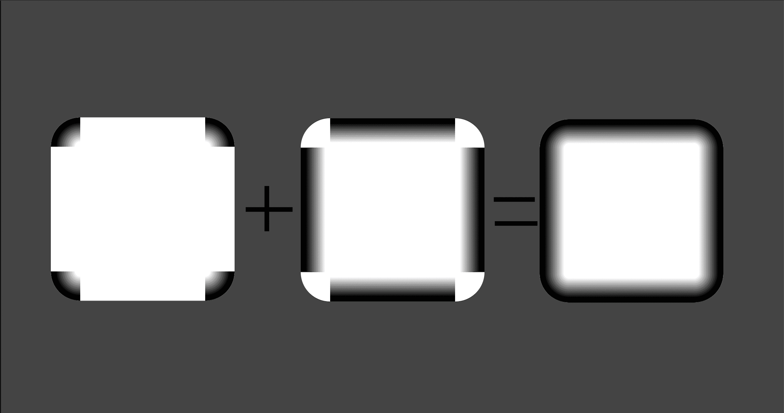
The effect is achieved by creating an overlay with backdrop-filter: blur(), and a mask-image that creates the vignette. The mask is a combination of 6 gradients - 4 radial gradients for each corner and 2 linear gradients.
See the image below to understand how these gradients are combined into a mask. The black areas mark the parts of our overlay that will be visible.
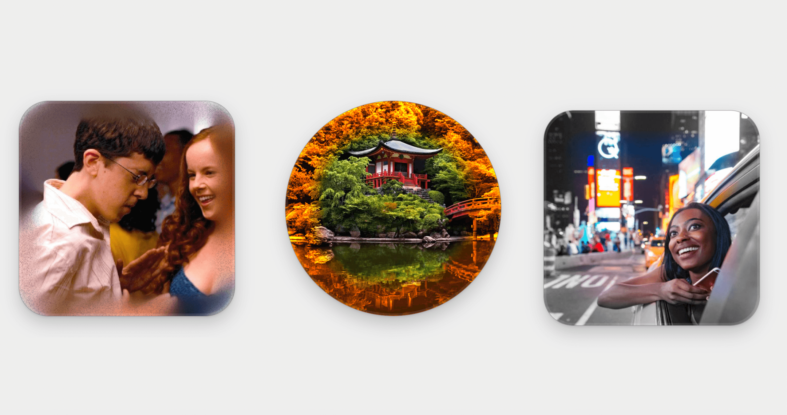
Since it's just a more fancy overlay it will work for everything - you can place it above videos, images or just regular HTML elements.
This vignette is also responsive and will adapt to the size of its container. 🔥
Getting more creative
In this article I am only discussing the Blur Vignette, but since we're operating with backdrop-filter you can get creative with different types of filters, not just blur, to achieve other interesting results.
Just switch up the filter and you can create a Grayscale Vignette, Sepia Vignette...whatever you like!
You can also stack multiple overlays with different parameters on top of eachother to make the transition smoother.
Here are some examples of such usage:
Blur Vignette Generator
To use the Blur Vignette effect in your own project, add the .blur-vignette element inside any container, then paste the CSS code from generator below inside your project.
Make sure to match the --radius parameter with the border-radius of the container and that the container position is set to relative / absolute / fixed.
.blur-vignette {
  --radius: 32px;
  --inset: 8px;
  --transition-length: 16px;
  --blur: 15px;


  position: absolute;
  inset: 0;
  border-radius: var(--radius);
  -webkit-backdrop-filter: blur(var(--blur));
  backdrop-filter: blur(var(--blur));
  --r: max(var(--transition-length), calc(var(--radius) - var(--inset)));
  --corner-size: calc(var(--r) + var(--inset)) calc(var(--r) + var(--inset));
  --corner-gradient: transparent 0px,
    transparent calc(var(--r) - var(--transition-length)), black var(--r);
  --fill-gradient: black, black var(--inset),
    transparent calc(var(--inset) + var(--transition-length)),
    transparent calc(100% - var(--transition-length) - var(--inset)),
    black calc(100% - var(--inset));
  --fill-narrow-size: calc(100% - (var(--inset) + var(--r)) * 2);
  --fill-farther-position: calc(var(--inset) + var(--r));
  -webkit-mask-image: linear-gradient(to right, var(--fill-gradient)),
    linear-gradient(to bottom, var(--fill-gradient)),
    radial-gradient(at bottom right, var(--corner-gradient)),
    radial-gradient(at bottom left, var(--corner-gradient)),
    radial-gradient(at top left, var(--corner-gradient)),
    radial-gradient(at top right, var(--corner-gradient));
  -webkit-mask-size: 100% var(--fill-narrow-size), var(--fill-narrow-size) 100%,
    var(--corner-size), var(--corner-size), var(--corner-size),
    var(--corner-size);
  -webkit-mask-position: 0 var(--fill-farther-position), var(--fill-farther-position) 0,
    0 0, 100% 0, 100% 100%, 0 100%;
  -webkit-mask-repeat: no-repeat;
}