RGB split (3D Anaglyph) glitch effect with CSS SVG filter
April 8, 2023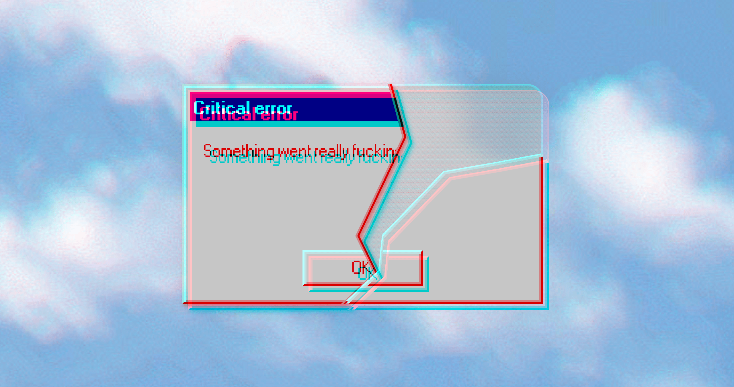
The RGB split effect, also known as RGB shift or 3D Anaglyph, is a popular visual effect that adds a sense of depth and dimensionality to images and videos. This effect is achieved by separating the red, green, and blue color channels (or red and cyan) of an image or video and offsetting them from each other. The result is a trippy, glitchy effect that makes the image or video appear as if it is shifting or splitting apart.
While this effect is usually achieved by using a video editing software, it is also possible to create it using CSS.
You might have already seen the effect recreated by stacking multiple elements on top of each other and applying mix-blend-mode, or in case of text by using multiple text-shadows.
However, there's simpler custom CSS filter approach that will let you apply the effect to any element without the need to duplicate elements or use multiple shadows.
In this blog post I'll explain how this effect works, how to use it and I'll give you a tool for generating your own RGB split effects. Let's dive into it!
How to use
Here's the filter that has to be embedded in HTML before we use it in CSS:
<svg width="0" height="0">
  <filter id="rgb-split">
    <feOffset in="SourceGraphic" dx="2" dy="2" result="layer-one" />
    <feComponentTransfer in="layer-one" result="red">
        <feFuncR type="identity" />
        <feFuncG type="discrete" tableValues="0" />
        <feFuncB type="discrete" tableValues="0" />
    </feComponentTransfer>
    <feOffset in="SourceGraphic" dx="-2" dy="-2" result="layer-two" />
    <feComponentTransfer in="layer-two" result="cyan">
        <feFuncR type="discrete" tableValues="0" />
        <feFuncG type="identity" />
        <feFuncB type="identity" />
    </feComponentTransfer>
    <feBlend in="red" in2="cyan" mode="screen" result="color-split" />

  </filter>
</svg>
Then in CSS all you have to do is:
#some-element { filter: url(#rgb-split); transform: translateZ(0); }
The transform: translateZ(0); improves the rendering in Safari and removes some of the artifacts that filter sometimes creates.
How it works
-
The feOffset primitives are used to create two duplicate layers of the image: one shifted to the right and downwards (dx="2" dy="2") and the other one shifted to the left and upwards (dx="-2" dy="-2").
-
The feComponentTransfer primitives are used to modify the color channels of each layer.
In the first one, only the red channel is kept while the green and blue channels are turned off (resulting in red layer).
<feOffset in="SourceGraphic" dx="2" dy="2" result="layer-one" /> <feComponentTransfer in="layer-one" result="red"> <feFuncR type="identity" /> <feFuncG type="discrete" tableValues="0" /> <feFuncB type="discrete" tableValues="0" /> </feComponentTransfer>For the second layer its the opposite - green and blue channels are kept and the red channel is turned off (resulting in cyan layer).
<feOffset in="SourceGraphic" dx="-2" dy="-2" result="layer-two" /> <feComponentTransfer in="layer-two" result="cyan"> <feFuncR type="discrete" tableValues="0" /> <feFuncG type="identity" /> <feFuncB type="identity" /> </feComponentTransfer> -
Finally feBlend is used to blend the two modified layers of the image (red and cyan) together using the "screen" mode. This mode brightens the image, and helps to create the RGB split effect.
The "RGB split" CSS filter generator
To make things easier for you, I've created this simple RGB split effect generator that will let customize it to your needs.
There's also an option to copy the inlined CSS filter so you can use it directly in CSS without having to embed the SVG in HTML.
Unfortunately inlined CSS SVG filters are not supported by Safari (16.4) so you need to embed SVG in HTML to support all browsers.

<svg width="0" height="0">
<filter id="rgb-split">
<feOffset in="SourceGraphic" dx="2" dy="2" result="layer-one" />
<feComponentTransfer in="layer-one" result="red">
<feFuncR type="identity" />
<feFuncG type="discrete" tableValues="0" />
<feFuncB type="discrete" tableValues="0" />
</feComponentTransfer>
<feOffset in="SourceGraphic" dx="-2" dy="-2" result="layer-two" />
<feComponentTransfer in="layer-two" result="cyan">
<feFuncR type="discrete" tableValues="0" />
<feFuncG type="identity" />
<feFuncB type="identity" />
</feComponentTransfer>
<feBlend in="red" in2="cyan" mode="screen" result="color-split" />
</filter>
</svg>