Fancy reveal animations with CSS masks and @property
April 4, 2023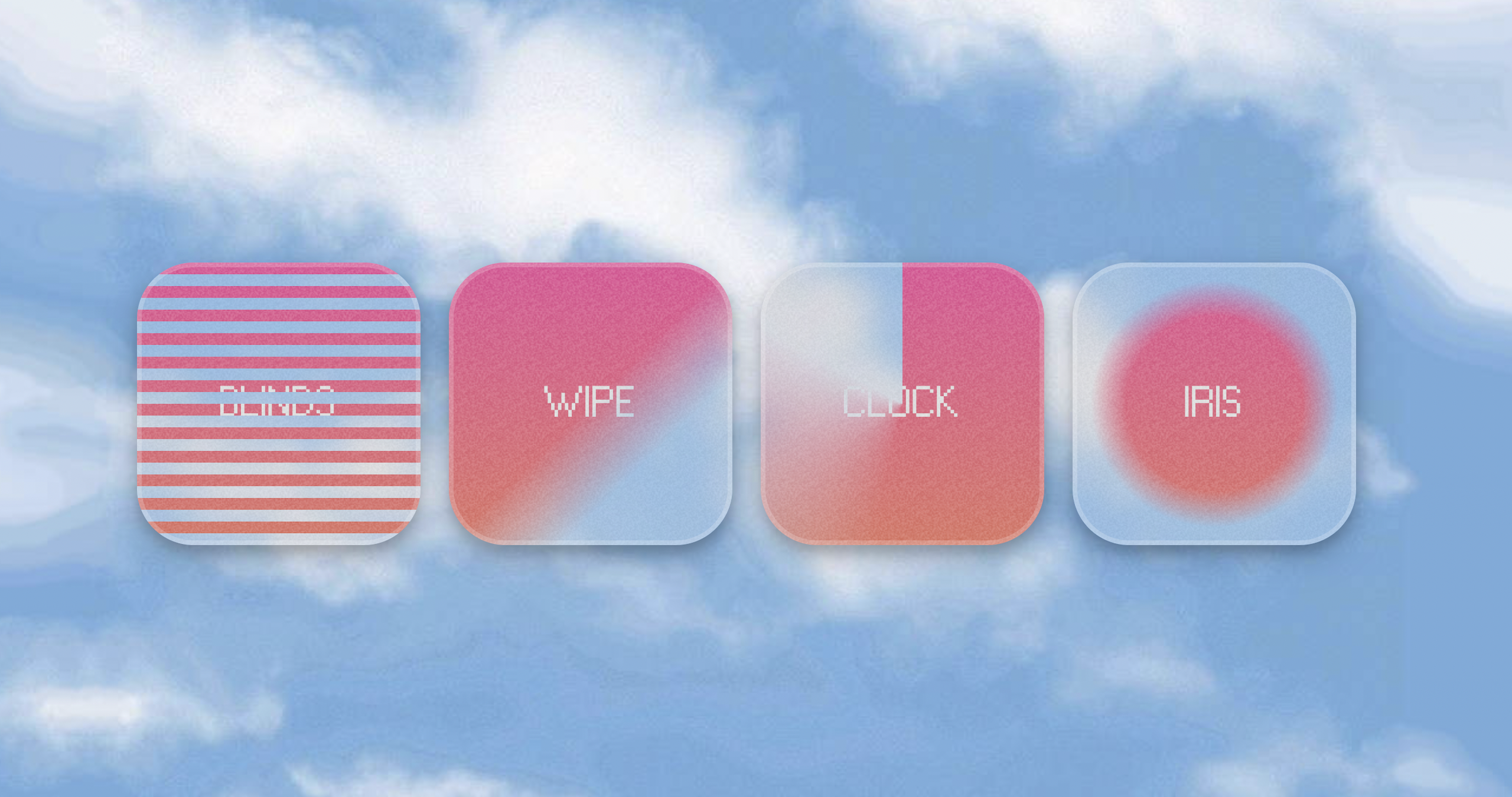
Hey there! Are you ready to learn about a cool new CSS trick?
With the new @property (at-rule) CSS API, we can easily transition values of custom properties (also known as CSS variables) just like we do with other CSS properties like opacity or transform. It's like magic! ✨
This feature is super powerful and lets us create all sorts of fancy reveal effects by animating masks. Want to see it in action? Check out these awesome examples below!
As of April 2023, @property API is only supported in Chrome 85+ and Safari 16.4+.
Blinds
The "Blinds" effect is a mask animation that creates the illusion of window blinds being opened or closed as you hover over an element. This effect is achieved by animating a series of horizontal or vertical segments that cover the content of the element.
@property --segment-size { syntax: "<length>"; inherits: false; initial-value: 0px; } .blinds { --initial-segment-size: 20px; --segment-size: var(--initial-segment-size); -webkit-mask-image: repeating-linear-gradient( to bottom, #000000, #000000 var(--segment-size), transparent var(--segment-size), transparent var(--initial-segment-size) ); transition: --segment-size 0.5s cubic-bezier(0.16, 1, 0.3, 1); } .blinds:hover { --segment-size: 0px; }
Wipe
The "Wipe" effect is another CSS mask animation that creates the illusion of an element being wiped clean or erased. This effect is achieved by animating a mask gradient that covers the content of the element.
When the animation starts, the mask gradient moves across the element, gradually revealing the underlying content. As it moves, the content appears to be wiped clean or erased, creating the illusion of a fresh start or a new beginning.
@property --wipe-position { syntax: "<percentage>"; inherits: false; initial-value: 100%; } .wipe { --wipe-position: 100%; --gradient-length: 20%; -webkit-mask-image: linear-gradient( to bottom right, black var(--wipe-position), transparent calc(var(--wipe-position) + var(--gradient-length)), transparent ); transition: --wipe-position 600ms cubic-bezier(0, 0.55, 0.45, 1); } .wipe:hover { --wipe-position: calc(-1 * var(--gradient-length)); }
Clock
The "Clock" effect is an animation that creates the illusion of an element being wiped in a circular motion, just like the hands of a clock. This effect is achieved by animating a conic gradient mask that covers the content of the element.
When the animation starts, the mask moves across the element in a circular motion, gradually revealing the underlying content.
This effect is perfect for creating a sense of time passing or for indicating progress.
@property --clock-hands-position { syntax: "<percentage>"; inherits: false; initial-value: 100%; } .clock { --clock-hands-position: 100%; --gradient-length: 30%; -webkit-mask-image: conic-gradient( black var(--clock-hands-position), transparent calc(var(--clock-hands-position) + var(--gradient-length)), transparent ); transition: --clock-hands-position 1s ease; } .clock:hover { --clock-hands-position: calc(-1 * var(--gradient-length)); }
Iris
The "Iris" effect is a CSS animation that creates the illusion of an element's content being revealed in a radial direction, like the opening of an eye's iris. This effect is achieved by animating a radial gradient mask that starts from the center of the element and expands outwards to reveal the underlying content.
When the animation starts, the radial mask gradually expands in outwards motion, revealing more and more of the underlying content as it expands.
This effect is perfect for creating a sense of unveiling or discovery.
@property --iris-radius { syntax: "<percentage>"; inherits: false; initial-value: 0%; } @property --iris-gradient-length { syntax: "<length> | <percentage>"; inherits: false; initial-value: 0px; } .iris { --iris-radius: 100%; --iris-gradient-length: 60px; --time: 600ms; -webkit-mask-image: radial-gradient( black, black var(--iris-radius), transparent calc(var(--iris-radius) + var(--iris-gradient-length)), transparent ); transition: --iris-radius var(--time) cubic-bezier(0, 0.55, 0.45, 1), --iris-gradient-length var(--time) ease-out; } .iris:hover { --iris-radius: -50%; --iris-gradient-length: 0px; }
Now lets see how we can combine multiple masks together to make even crazier effects.
If you want to learn how mask composition works read this awesome article from Oscar Jite-Orimiono.
Examples below are using mask-composite property that is only supported in Safari and Firefox. To make them work in Chrome I'm using a fallback to -webkit-mask-composite which is a non standard CSS property that is not on a standards track (but works in Chrome and Safari).
Iris Clock
The "Iris-clock" effect is a combination of the "Iris" and the "Clock" effects. The mask-composite is set to intersect so that the final mask is the intersection of the two masks.
And of course we're animating both of them!
Diamond Wipe
Here three masks are combined together. Two repeating-linear-gradient masks "dissolve" the target in a diamond shape, and then the "Wipe" effect is added on top of them.
Iris grid
Similar to the previous example but now the repeating-linear-gradient masks dissolve the target in a grid shape with the "Iris" effect added on top.
Mixer
The "Mixer" is a monstrosity that comes from combining "Blinds", "Clock" and "Iris" effects together.
This time the mask-composite is set to exclude so that the non-overlapping regions of source mask and destination mask are combined.
Conclusion
CSS masks and custom properties can be combined to create a range of impressive reveal effects that can give your apps more flair.
We barely scratched the surface of what's possible and I can't wait to see more complex examples of this technique in action. So give it a try and let your creativity run wild! ❤️