Create beautiful heat maps with only CSS
January 17, 2023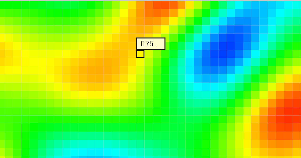
A heat map is a type of data visualization that uses color to represent different values or ranges of data. The color scale of a heat map is used to represent the intensity or magnitude of a particular data point, with warmer colors like red or yellow indicating higher values and cooler colors like blue or green indicating lower values.
Heat maps are often used in a variety of applications, including:
- Geographic data, to show the distribution of data points or variables across a map,
- Medical imaging, to highlight areas of disease or injury in an image,
- Website analytics, to show which areas of a website are most popular or frequently clicked on by users,
- Fitness and health apps: Some fitness and health apps use heat maps to track and visualize data on user's activities, such as running and sleep patterns.
- Github uses heat maps in the "contribution graph" section of a user's profile to visualize the frequency of code changes made by the user over time. The heat map is a graphical representation of the number of commits made to the repositories at different times, and it shows when the most activity is taking place.
In this blog post I'll show you three examples of heat maps that you can create with just CSS without having to install external packages or writing JavaScript: a rainbow color scale, a single color sequential scale, and a two-color sequential scale. Each example is accompanied by the corresponding CSS code, which you can use and modify to create your own heat maps.
All you have to do is:
- copy and paste the styles of the type of heat map you like,
- set the class name on an element
- set the --intensity CSS property (a number between 0 and 1) representing a magnitude of phenomenon for a given data point.
Resulting heatmap should be a grid of elements looking something like this:
... <div class="blue-to-red" style="--intensity: 0.2"></div> <div class="blue-to-red" style="--intensity: 0.52"></div> <div class="blue-to-red" style="--intensity: 0.68"></div> ...
1. Rainbow color scale
When creating the rainbow color scale the background color is set using the HSL color model, where the hue is determined by the --intensity value. We're starting with blue (240deg) when --intensity is 0 and going to red (0deg) when --intensity is 1.
.rainbow { --hue: calc((1 - var(--intensity)) * 240); background: hsl(var(--hue), 100%, 50%); }
2. Single color sequential scale
This type of a heatmap while not as fancy as the previous one, is in many ways more readable and better suited for color-blind people. In this example we're creating a color scale that goes from white to dark green using linear interpolation:
.green { --r: 3; --g: 72; --b: 29; background: rgb( calc(255 - ((255 - var(--r)) * var(--intensity))), calc(255 - ((255 - var(--g)) * var(--intensity))), calc(255 - ((255 - var(--b)) * var(--intensity))) ); }
3. Two color sequential scale
By modyfying a bit code above you can get a color scale that interpolates between two specified colors. Here, let's interpolate between blue and red:
.blue-to-red { --r-1: 0; --g-1: 0; --b-1: 255; --r-2: 255; --g-2: 0; --b-2: 0; background: rgb( calc(var(--r-1) - ((var(--r-1) - var(--r-2)) * var(--intensity))), calc(var(--g-1) - ((var(--g-1) - var(--g-2)) * var(--intensity))), calc(var(--b-1) - ((var(--b-1) - var(--b-2)) * var(--intensity))) ); }
Sometimes you just may want to only highlight the extremes. To do that we're going to use the RGBA color model, which is similar to RGB but with an additional "alpha" value that represents the transparency of the color. We'll make it so that the color will be fully opaque when at the extremes (blue or red or 1 intensity respectively) and fully transparent when at the middle value (0.5 intensity).
.blue-transparent-red { --r-1: 0; --g-1: 0; --b-1: 255; --r-2: 255; --g-2: 0; --b-2: 0; /* remaps the "--intensity" value to range from -1 to 1 */ --alternate: calc((0.5 - var(--intensity)) * 2); /* takes an absolute value of "--alternate" this way when "--intensity" is equal 0 or 1 the alpha = 1 but when its 0.5 (middle value) the alpha = 0 */ --alpha: max(var(--alternate), -1 * var(--alternate)); background: rgba( calc(var(--r-1) - ((var(--r-1) - var(--r-2)) * var(--intensity))), calc(var(--g-1) - ((var(--g-1) - var(--g-2)) * var(--intensity))), calc(var(--b-1) - ((var(--b-1) - var(--b-2)) * var(--intensity))), var(--alpha) ); }
That's good, but we can make it even better by applying easing to the alpha channel:
.blue-transparent-red-eased { --r-1: 0; --g-1: 0; --b-1: 255; --r-2: 255; --g-2: 0; --b-2: 0; /* remaps the "--intensity" value to range from -1 to 1 */ --alternate: calc((0.5 - var(--intensity)) * 2); /* takes an absolute value of "--alternate" this way when "--intensity" is equal 0 or 1 the alpha = 1 but when its 0.5 (middle value) the alpha = 0 */ --alpha: max(var(--alternate), -1 * var(--alternate)); /* Apply cubic easing to the alpha channel */ --alpha-ease-cubic: calc(var(--alpha) * var(--alpha) * var(--alpha)); background: rgba( calc(var(--r-1) - ((var(--r-1) - var(--r-2)) * var(--intensity))), calc(var(--g-1) - ((var(--g-1) - var(--g-2)) * var(--intensity))), calc(var(--b-1) - ((var(--b-1) - var(--b-2)) * var(--intensity))), var(--alpha-ease-cubic) ); }
Aaaand...that's a wrap! As you can see you can create beautiful heatmaps with just few lines of CSS without having to rely on JavaScript or external packages. Have fun experimenting!