CSS heat map and thermal vision effect (SVG filters)
February 9, 2023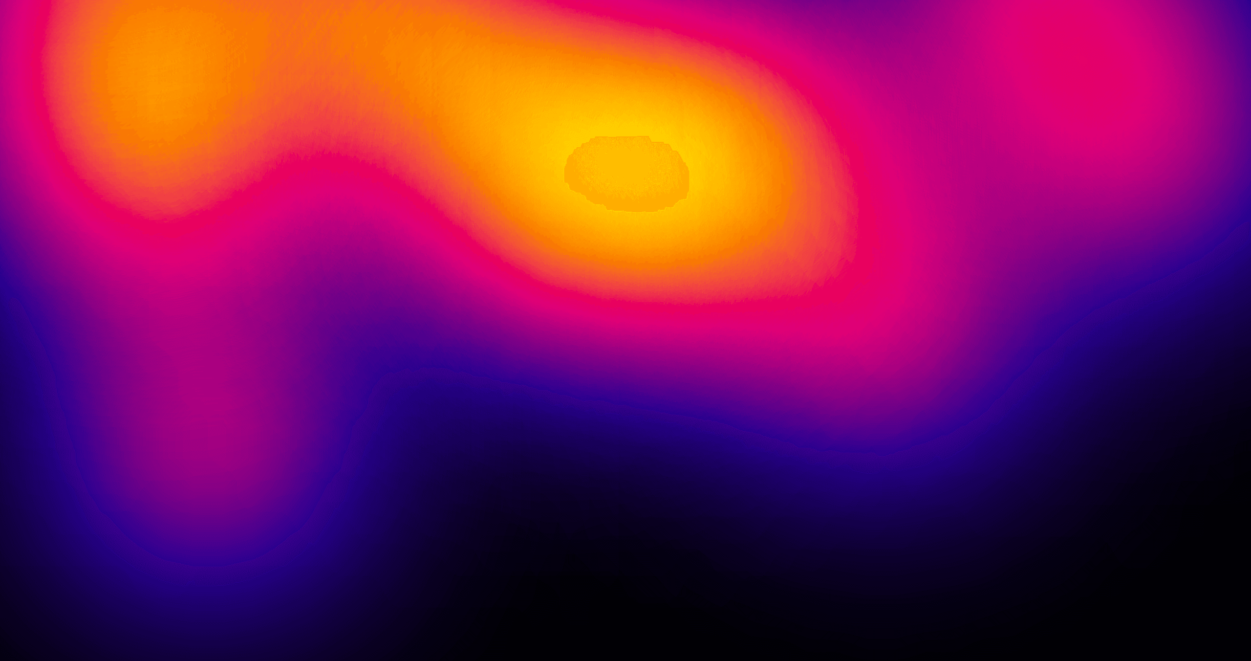
In the previous blog post I've discussed how to create heat map color grading using pure CSS. That approach while simple has two major limitations:
- if you want to create multi color scale (more than two colors) you're limited by the order of the colors on the hue color wheel
- it will not work on videos or images or complex elements with gradients that represent a data set
The new SVG filter technique that I am about to show you is much more flexible allowing you to not only create any color scale you want but also apply it to any element on a page - image, video, canvas, you name it!
How it works
First of all, SVG filters are shaders for DOM elements. A shader is a programme that changes the color or a position of each pixel of an element the shader is applied to.
There's feComponentTransfer filter effect that allows us to change the color of each pixel by remapping each color channel in a pixel (R, G, B and A) to a new value. In particular it remaps the color channel to a place on a gradient that we can define.
So how can we leverage that?
The starting point is - get any data set and represent each data point with a color so that the min value is black, max value is white and everything in between is a shade of gray. You can represent the data with HTML elements or an image, whatever you like. For this simple demo, let's use a div with black to white gradient background.
Then using feComponentTransfer write a programme that will remap color of each pixel to a value on a gradient defined by us. Let's start with a blue to red gradient.
Important thing here is that color component functions see color channels as fractons (values 0 to 1) as opposed to CSS rgb() that takes values ranging from 0 to 255.
To convert any RGB color to fractions, just divide its R, G and B channel by 255:
Blue: Red: R: 0/255 = 0 R: 255/255 = 1 G: 0/255 = 0 G: 0/255 = 0 B: 255/255 = 1 B: 0/255 = 0
Then put these colors inside the tableValues attributes:
<svg xmlns="http://www.w3.org/2000/svg" width="0" height="0"> <filter id="blue-red" color-interpolation-filters="sRGB"> <feComponentTransfer> <feFuncR type="table" tableValues="0 1" /> <feFuncG type="table" tableValues="0 0" /> <feFuncB type="table" tableValues="1 0" /> </feComponentTransfer> </filter> </svg>
When you apply above filter to the black to white gradient this is what you get - the min value (black pixels) become blue, max value (white pixels) become red and everything in between (shades of grey) become something inbetween (purple'ish).
Thermal vision
Now let's do something cool. Let's define another filter for a thermal vision effect. The colors we're going to use are:
Black: Navy: Pink: Orange: White: R: 0/255 = 0 R: 32/255 = 0.125 R: 204/255 = 0.8 R: 255/255 = 1 R: 255/255 = 1 G: 0/255 = 0 G: 0/255 = 0 G: 0/255 = 0 G: 215/255 = 0.843 G: 255/255 = 1 B: 0/255 = 0 B: 140/255 = 0.549 B: 119/255 = 0.466 B: 0/255 = 0 B: 255/255 = 1
The filter looks like this:
<svg xmlns="http://www.w3.org/2000/svg" width="0" height="0"> <filter id="thermal-vision" color-interpolation-filters="sRGB"> <feComponentTransfer> <feFuncR type="table" tableValues="0 0.125 0.8 1 1" /> <feFuncG type="table" tableValues="0 0 0 0.843 1" /> <feFuncB type="table" tableValues="0 0.549 0.466 0 1" /> </feComponentTransfer> </filter> </svg>
Now let's apply it to the grid from the previous blog post:
Awesome, isn't it?
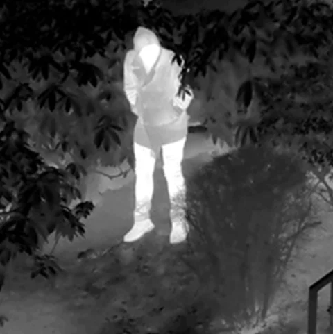
Now let's try it out on a black div with blurred white circles and white text stacked on top of each other
thermal vision
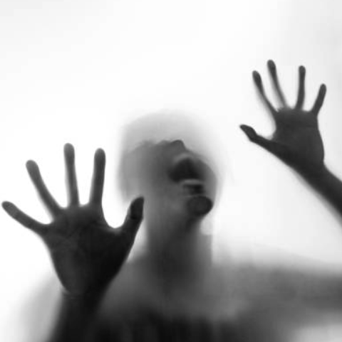
It works even on images!
But what if your image or element represents data in reverse, where min value is white and max value is black?
You could just reverse the order of colors in feComponentTransfer but there's way simpler way than that! Fortunately you can chain CSS filters, so before you apply the #thermal-vision filter apply the invert(1) filter:
img { filter: invert(1) url(#thermal-vision); }